Saturday, August 9, 2008

Configurations


The Planter Bike Rack comes in a variety of configurations, depending on the actual bike parking needs of any given area with units stacking back to back in particularly dense areas. And since each pole locks into a separate receiving hole in the bottom of the concrete portion, a bench can be swapped out for two of the poles using the same bend geometry.

The Planter Rack


Here's our entry, the Planter Bike Rack. This first image shows two units back to back, with space for up to 12 bikes (fourteen if you crammed them in). The whole unit is comprised of several pieces: a concrete planter, with a thick lip for bikers and pedestrians to balance a bag on (one of the behaviors that came up from our research) and steel bent tube bars. The triangular loop on the end can engage several different points on a bike, providing security.

Cityracks competiton

We wanted to expand the scope of our furniture design beyond the home and entered the recent CityRacks competition. We sought to engage the entire city in the design of a new bike rack. We researched the behaviors of cyclists and everyday pedestrians to come up with a hybrid bike rack system that provides customizable bike parking and seating areas. In keeping with New York's PlaNYC and the One Million Trees initiative, we incorporated a planter for local greenery. See the images below for some of the thinking behind the rack.

Friday, February 1, 2008

Finished bench

Work work work

After a whole lot of sawing and sanding and and bolting, we put this little guy together. The work itself didn't take all that long, which was a refreshing change from the shelves we did previously. After making sure everything would fit together, we were ready to head up to Harlem to install the piece.

Reclaiming the wood


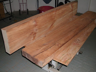
We got the wood (which used to be a factory beam) from Build It Green. Doesn't look like much yet, but was beautiful after we planed it down.

Bench work pics

As you all may know, we've been working on a bench for David and Alysia. We had some issues with the fabrication of the legs but now it's finally done. Over the next couple of posts we'll run through the construction of the bench!

Monday, December 24, 2007

More press

The nytimes did an article on Alysia and David's house and green construction as a whole and we got a mention for the office!
here it is

Friday, October 12, 2007

Pic from The Nest


Thanks for the pics Caitlin

Saturday, September 29, 2007

The Nest

The Nest magazine did a multi-page spread on the Harlem House in their latest issue, with our work in the office prominently featured. Thanks for the shout-out Alysia!

Final Bench design


Here's a quick CAD view of the final bench design, complete with AutoCAD Siting Woman and Strutting Man

Friday, September 21, 2007

real world strikes again

The past few weeks have been rather hectic for all of us. Those of us still in school (everyone except for David) had classes start up again, so our free time got drastically reduced. We're almost to the finish line on the bench for David and Alysia. We hit a little snag in the form of a budget cap that doesn't allow for the metal legs we had wanted to use. Didn't realize how expensive that sort of thing would be. We sketched out some wood leg alternatives but we all think the metal is much better, so we're going to eat that cost. Lesson learned: make sure to nail down a budget before going beyond initial concepts.
We've also been contacted with more furniture requests by several other people that we met at various Green Drinks or simply found us on flickr. We'll keep updating the blog as these new opportunities progress.

Sunday, August 19, 2007

Feeds

We just enabled feeds for the blog, so now you can find us in your nifty little RSS readers. Our apologies for not enabling that earlier.

Methodology

With this project we're going to be going into a bit more depth on our motivations and more behind the scenes aspects of our design process. We're (almost) all still students so this is somewhat new for us. Just to let y'all know...
In the last project we tried to come up with concepts together before presenting them to the clients. We found that this method just took too long and quite possibly suppressed some good ideas since it was hard to get everyone to agree and sign off on each idea. This time we're all coming up with concepts completely individually and then bringing them together for some internal discussion, editing and refinement. This keeps us out of each other's hair while brainstorming so we can give the clients as many possible directions as possible.
In terms of format, some of the drawings were originally done in Illustrator, some on paper and some in AutoCAD, with our resident AutoCAD master Kris putting them all together. We wanted to avoid confusion and let the designs all speak for themselves, rather than one on paper suffering because it possibly wasn't seen to be as polished as one on the computer. Of course the first round of drawings were done on paper. We can get more ideas out there much more quickly that way.

Moving forward on the bench

After seeing all our sketches David and Alysia chose the angled plane one with the "stalks" for hanging hats and gloves. Next step was to refine that one a bit and give them some more options on how to take it further. We broke it up between the three of us (Joe and Tiffany are off in Copenhagen) and each took a different direction. Simon focused on a shorter design, Kris played with angles and some crazy legs while David took a more linear approach using Tatami mat proportions, which are 1 by 2 rectangles. Check the images below the jump (click for full-size).